
My proposal tries to take a stance on conveying a nice, comfortable value to the customer’s target audience.
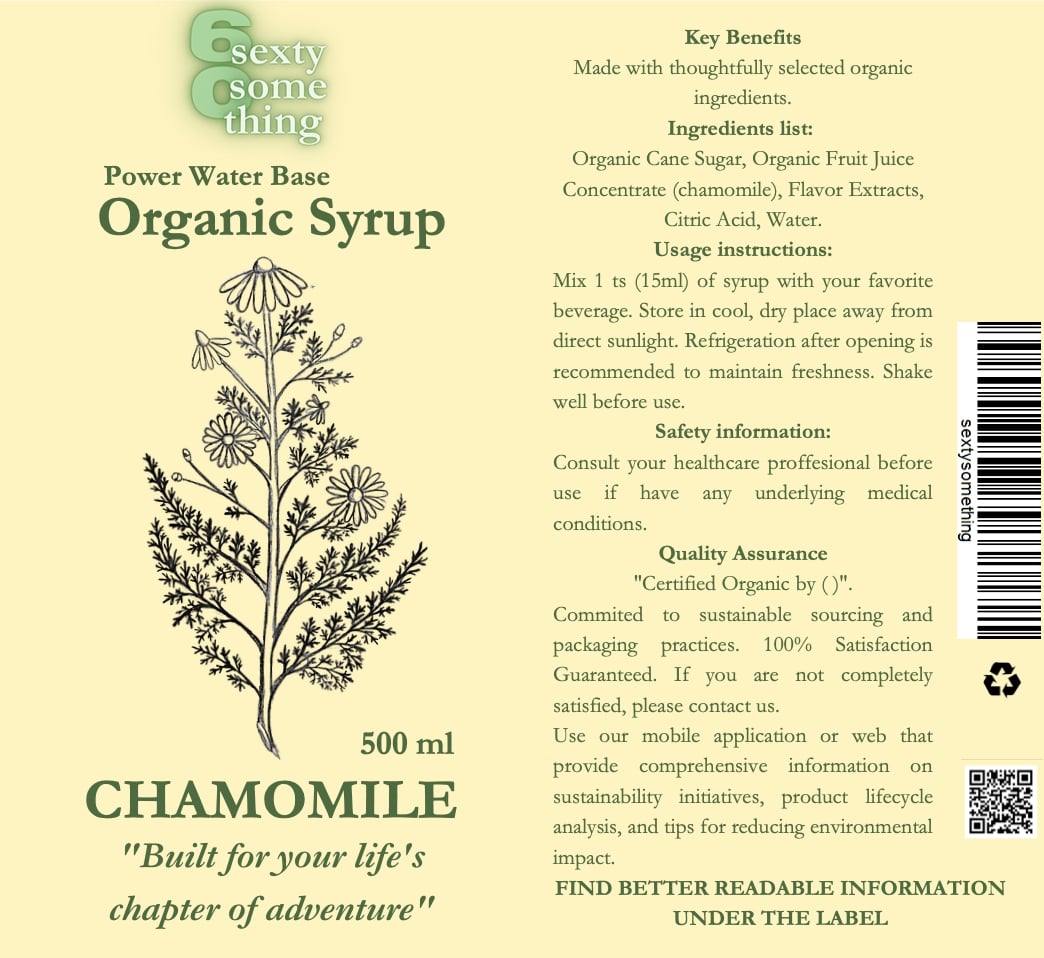
The tagline is “Built for your lifes chapter of adventure”, which is meant to evoke exciting feeling to use. Logo is in “Modern-mode”.
The flavours were chosen to be modern, new, refreshing – so that they were in harmony with the slogan (the user can experience a new adventure through these flavours). The colours were chosen based on the flavours chosen, in pastel tones and the combination (background x font) was contrasting and easy to read that way.
The image was hand drawn to evoke an organic, sustainable, simple, comforting feel.
The font chosen was Gartmont, which is easy to read.
The label is double sided – on the other side the customer will find easier to read information in a larger font. There is a peel-off adhesive made of bio-degradable material. The inks used are water based, which are also bio degradable. The paper will be made from recycled material. There is a QR code on the label to guide the user to all the product information including ideas.
The brief was very enjoyable, I had a creative idea instantly. Additionally, I asked my grandparents for their preference by product label and then for feedback on my design. I was having fun!

