
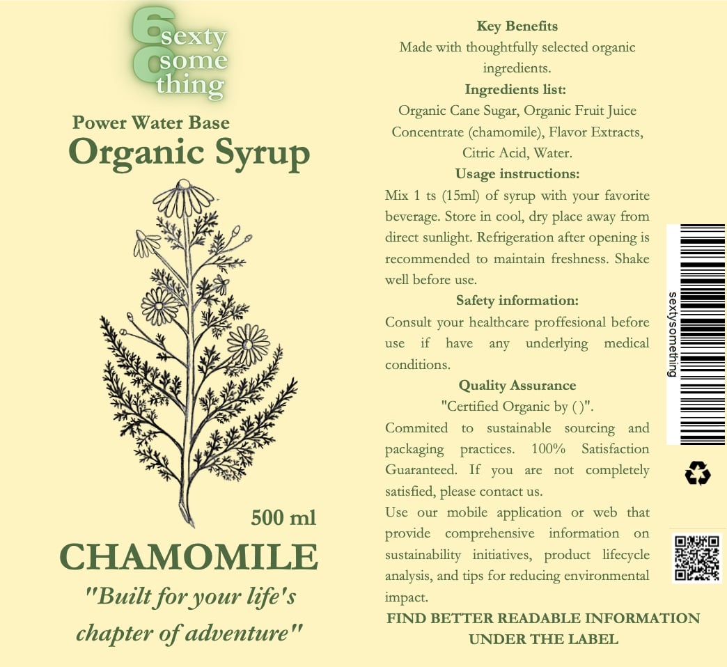
My design incorporates a double-sided label – so that if customers have trouble reading it, they can peel off the label and read the ingredients outside the label. The label also includes a QR code that ideally redirects to a website that will provide all the information about sustainability, product usage and the ability to recycle the packaging. The font chosen was Garmont – which is easy to read, in a larger font. The colours were used in contrasts.

