
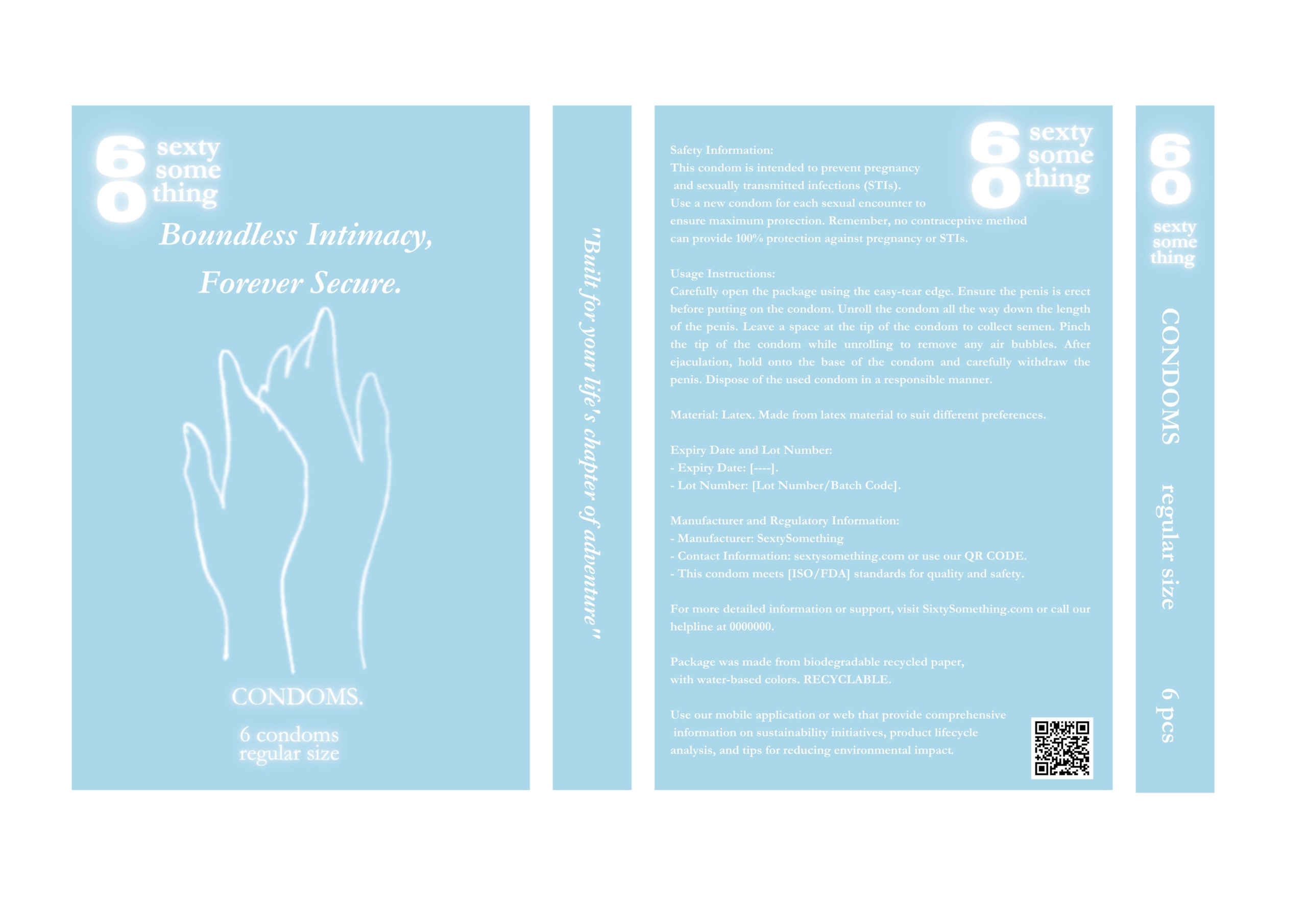
At first glance, I thought to portray something “heavenly”. That’s why I used the colors of the sky (pale blue, white), which can evoke a pleasant atmosphere, adventure and so on. Moreover, they are contrasting, so they are easy to read.
The logo is in a more modern style so that there is a contrast between the font, which is chosen as GARAMONT as it is easily readable. This conveys the contrast of the product.
The CONDOMS heading is smaller in size to avoid customer shame when shopping, for example. (I know myself how embarrassing it is to buy products like this that have the name in font across the whole label, and everyone knows what we’re buying). That’s why I combined a simpler design with the associations that different elements can evoke.
Instead, the label says ” Boundless Intimacy, Forever Secure” in a larger font, which may be associated with this particular product. I also chose the brand slogan in this sense “Built for your lives chapter of pleasure”. The image is hand-drawn, simply, like two hands touching, which can also evoke pleasure.
There is a QR code on the back where customers can find out more information. Material is recycled paper, with biodegradable water based colors (in minimum use)
I had fun while creating it – I also tried to ask the target group for feedback.

