
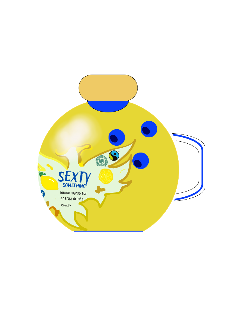
Sexty Something® is an active brand that listens to its customers. Its symbol being the phoenix (for the renewal of the metabolism), it seeks to get itself talk about by offering products that are out of the ordinary. The ingenuity of substracts aims to make valuable and sustainable products. Indeed, these remind of everyday elements focused on fun and attractive activities: bowling (with the cup) and walking in the open air (tree). Labels are simple and visual in order to provide concise and impactful information on products. Also, the sans serif fonts and the color used make it possible to read all the information.
The ubiquitous blue colour associated with yellow is part of the brand image and encourages tonicity and optimism among consumers.
Also, the use of hitherto unseen materials respectful of the environment without specifying it explicitly allow to reconcile the values of the consumers of the brand. Also, in consideration for senior consumers, the chip embedded on the verso of the labels will be passive in order to preserve them from emissions.
The addition of an animation in a QR-code on the verso of the label will force the consumer to become involved in the use and history of the product.
Since my design is too large, here is the link to access the files: https://we.tl/t-QGr1RURgS8
