
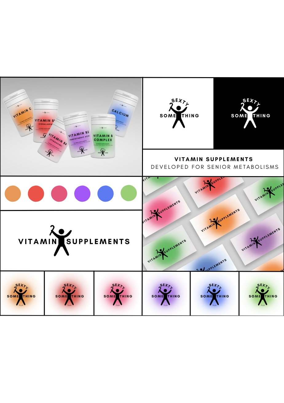
Creating a logo for the age group of sixty proved to be a challenging and rewarding experience. Within the designated four products, I chose to work with condoms, power drinks, and vitamin supplements, excluding body cream.From the start, my primary objective was to find an interesting, unique, and captivating approach for the logo that would be inclusive and respectful towards older individuals. I wanted to create something that would represent this more contemporary phase of life without causing any offense to the target audience.The logo subtly and creatively incorporates elements related to energy and the celebration of that energy, catering to the specified age group while avoiding stereotypes or clichés. The intention was to communicate the ideas of health, pleasure, and well-being subliminally, without being offensive. I also wanted the logo to be versatile in its usage, including the use of positive and negative space, making it recognizable in its entirety or with just a portion of it. Additionally, I aimed for it to be adaptable to future products that the brand may introduce. I invested time in gathering opinions from individuals within this age group, seeking both project guidance and a kind of approval.
(The rest of the description throughout the process is on the pdf document).
